Function over form?
I was walking on a back lane of Amoy Street when I spotted this shophouse back.

Shophouse dotted with aircon compressors
I have no idea what’s going on in the building, but they sure require a lot of air-conditioning.
Here’s another view.

Another view of shophouse dotted with aircon compressors
When a building wall is practically covered with aircon compressors, something is seriously wrong somewhere.
PSFK Conference Asia 2008
PSFK, an international consultancy specializing in trends and innovation, is organising the PSFK Conference Asia 2008 for those in the creative business. The full-day event is happening on 10 October 2008.
The conference covers topics like youth trends, social media, creativity and innovation, collaboration, digital democracy and the impact of change in China, with speakers from companies including MTV, NASA, Panasonic and agencies including Flamingo International, Mindshare, Profero and Wieden + Kennedy.
I did a short interview with PSFK’s CEO Piers Fawkes to find out more about the conference.
Coleman: I understand that PSFK started with you and your friend emailing each other trend and idea news, and eventually posting it on PSFK.com. Now, what’s the story behind the PSFK Conference Series?
Piers: I had been to too many bad conferences. Some had CEOs talking about what it’s like to be a CEO to an audience of non-CEOs, others had doers who weren’t directed enough. I wanted to create an event with quickfire presentations and talks where the audience could use their learnings the next day back at work.
That explains why the PSFK conference can have almost 20 speakers – each one has less than half an hour. Short and sweet.
It’s also good to know that I’m not the only one who’s been to too many bad conferences. And here’s someone who’s actually doing something about it.
Coleman: You’ve had PSFK conferences in London, Los Angeles, New York and San Francisco. Now it’s coming to Asia, with the first one in Singapore. Why Singapore?
Piers: Partly because of the strong heritage Singapore has a heritage as a crossroads of creativity and business; partly because my partner in Asia, Brian Tiong, is there – and partly because we thought it was the perfect place to start our journey into Asia.
The PSFK website is quite a well-known site to get insights on trends. The color scheme is purple. The PSFK logo is purple. They also have the Purple List. I had to ask this last question:
Coleman: What’s with all that purple?
Piers: It’s to do with luxury – or the color of luxury. PSFK in its first iteration as a business was a luxury consultancy. I ran it with Simon King – the SK of PSFK. It wasn’t very successful so I put the company to sleep for a while. When Simon and I started the site, we thought we’d use the URL and the color scheme of the previous company!
An interesting event by an interesting company – I’ll definitely be attending (I was invited for it).
Event link: PSFK Conference Asia 2008
Social media “activists” response to AIMS – frequently asked questions
Update – press coverage:
- Free public servants to engage online (WEEKEND TODAY, 20th Sept 2008) – Alicia Wong features us in her article.
- Rules for political films still a hot potato (Straits Times, 20th Sept 2008) – Lynn Lee covers the forum and mentions us.
- How Should We Expand Political Space on the Web? Public Opinion Split (ZaoBao, 21st Sept 2008) – ZaoBao covers the forum. English translation in the comments.
* * *
I was in the public forum today discussing the “Consultation Paper by the Advisory Council on the Impact of New Media on Society (AIMS)”.
Near the start of the event, the chairman Mr Cheong Yip Seng mentioned that some “social media activists” gave some “thoughtful” and “constructive” feedback 3 days ago to the AIMS committee.
He was referring to the response given by 9 bloggers, including myself.
I won’t go into the forum itself, but when the forum ended, it turned out that the (mainstream) media and other attendees had many questions regarding our response.
Here are some of the frequently asked questions:
Are you the Bloggers 13?
No, we’re another group of bloggers.
Those who contributed to the response include Kevin Lim, Ivan Chew, Lucian Teo, Walter Lim, Kenneth Pinto, Vanessa Tan, Sivasothi N., Jude Yew and myself.
Who are you then? The “social media activists”?
We call ourselves the “media socialists“, but we normally don’t use that name because it gives people the wrong idea – we’re not socialists. We’re a group of academics, civil servants, consultants and designers who are passionate and actively involved in social media, or what many people call “new media”.
This means we’re not quite activists as well. Let us know if you can think of a better name for us.
Why did you send this collective response to AIMS?
Being passionate about social media, we have regular discussions on the subject, so when the AIMS paper came out, we naturally started discussing it. Eventually, one of us had the idea of compiling our responses together and sending it to AIMS, as it was a good opportunity for us to contribute to our society.
Your collective response seems to focus more on e-engagement, as opposed to online political content, protection of minors, and immunity for intermediaries. Why is that?
We see a lot more potential in how the government can engage citizens more deeply through social media, potential that we’re currently not harnessing.
As for the other areas, we support the recommendations on protecting minors and immunity for online intermediaries, and have nothing much to add there. And none of us are political bloggers, so online political content isn’t really our domain.
You had an interesting suggestion to have an online Hong Lim Park.
That was wrongly attributed to us.
Brain Rules
It’s not everyday that I read a book about the brain that is readable, useful, and actually entertaining.
Brain Rules: 12 Principles for Surviving and Thriving at Work, Home, and School by John Medina falls firmly under this category.
It contains 12 “rules” or facts about the brain that scientists are certain about, and how they can be applied in our lives.

The first rule, for instance, is that exercise boosts brain power:
Researchers found a group of couch potatoes, measured their brain power, exercised them for a period of time, and re-examined their brain power. They consistently found that when couch potatoes are enrolled in an aerobic exercise program, all kinds of mental abilities begin to come back online. Positive results were observed after as little as four months of activity.
Medina goes on,
It was the same story with school-age children. In one recent study, children jogged for 30 minutes two or three times a week. After 12 weeks, their cognitive performance had improved significantly compared with pre-jogging levels. When the exercise program was withdrawn, the scores plummeted back to their pre-experiment levels.
Now, if this doesn’t convince you to get off your seat, I don’t know what would.
Anyway, here are all the 12 brain rules:
EXERCISE | Rule #1: Exercise boosts brain power.
SURVIVAL | Rule #2: The human brain evolved, too.
WIRING | Rule #3: Every brain is wired differently.
ATTENTION | Rule #4: We don’t pay attention to boring things.
SHORT-TERM MEMORY | Rule #5: Repeat to remember.
LONG-TERM MEMORY | Rule #6: Remember to repeat.
SLEEP | Rule #7: Sleep well, think well.
STRESS | Rule #8: Stressed brains don’t learn the same way.
SENSORY INTEGRATION | Rule #9: Stimulate more of the senses.
VISION | Rule #10: Vision trumps all other senses.
GENDER | Rule #11: Male and female brains are different.
EXPLORATION | Rule #12: We are powerful and natural explorers.
The nice thing about Brain Rules is that the book comes with a DVD with entertaining video presentations on each of the 12 rules – an excellent and painless way to make the ideas in the book stick. Do check out the Brain Rules website as well, which has a couple of the videos.
Now, time for me to get some exercise.
How to sustain your corporate blog
A client recently asked me to give a presentation about blogging – how to make blogging successful in their organization.
I didn’t have to convince this client that blogging is an important medium with great potential – they already believed it. In fact, they’ve already made a number of attempts at different forms of corporate blogging.
Except that most of these efforts eventually fizzled out, often because the bloggers eventually became “too busy”.
This problem is common among many other organizations I’ve dealt with. They’ve tried out blogging, sometimes with great fanfare. But the results have turned out disappointing. The blogs, hardly updated, and mostly uninteresting, mostly fade slowly into oblivion.
Corporate blogging isn’t an easy and straightforward matter, if you want it to be successful and sustainable. It’s not just a matter of setting up a blogging system, and convincing some volunteers to contribute.
Sustainable corporate blogging needs to be approached systematically, with the following factors accounted for, otherwise it will be just a hit-and-miss affair
Intrinsic motivation of blogger
Is the blogger motivated to blog? Or are they just an unwilling volunteer?
I’m not talking about extrinsic motivation here (“I want to blog so that I can get a raise”), but intrinsic motivation. The blogger has to believe in blogging, that their voice through blogging can make a difference to the organization.
Don’t even bother if you don’t have an intrinsically motivated blogger.
Ability of blogger
Just because a blogger is highly motivated and enthusiastic about blogging doesn’t necessarily make them the right person to blog.
Can your blogger write in an engaging manner, or are they effective sleeping pill substitutes?
Your blogging efforts (and your readers, if any) will soon doze off if it’s the latter.
Sociocultural support
Your motivated and competent blogger does not blog in vacuum. They are affected by their peers and colleagues.
Is your blogger eyed with suspicion and disdain? Do they become the butt of “harmless” jokes at the water cooler? Or is the blogging role encouraged and admired by colleagues and peers?
If your blogger does not get social support from co-workers, motivation will soon wilt.
Top management support
The corporate blogging effort probably has top management approval, but how strong is it?
Is the blogging project some stealth project that top management can quickly denounce if something goes wrong? Or are they fully behind the effort?
If the blogger wants to interview the CEO, does the CEO welcome the interview, or is the CEO “too busy” and puts the blogger on hold? Indefinitely?
Top management’s actions towards the blogger speaks volumes about their attitude towards blogging, no many how much lip service they give. And their attitude towards blogging often cascades down to the rest of the organization.
If top management fully supports blogging, then the rest of the points should come quite easily.
Resource support
If the blogger requires additional resources for blogging, such as a digital camera, does the blogger get it? Is there a real and reasonable budget allocated for blogging? Or must the blogger beg, borrow, or steal to get necessary resources to support the blogging effort
Time
Blogging – quality blogging – takes a lot of time. Is blogging an additional responsibility for the blogger? Or is the blogger relieved of some other responsibility, so that they actually have the time to blog?
This point is so obvious, but yet it’s almost always overlooked. We somehow expect bloggers to keep blogging consistently, in addition to their normal work, and despite their already-packed schedules. Unless your blogger is wildly passionate, obsessive, or slightly insane, you can expect the blogging frequency to decrease.
Extrinsic motivation and accountability
Congratulations if you’ve met all the previous criteria – your corporate blogging efforts already has a very good chance of sustaining, even without this point.
Extrinsic motivation is how the blogger as an employee rewarded for their performance in blogging. (What “performance” means in this case is another matter.) Is blogging among their KPIs? Is their performance bonus tied to their blogging performance?
Closely related to this is accountability. Who is accountable to ensure the blogging performance? Who is held accountable for non-performance?
Many bloggers reading this might balk at this last point, since they’ve only known blogging out of pure passion, and think that extrinsic motivation and accountability might kill the passion.
It would, if this was the primary motivation.
I would emphasize that extrinsic motivation and accountability should be put in place last, only after all the preceding points have been put properly in place.
Once the preceding points are in place, extrinsic motivation and accountability then becomes an additional and official recognition of the blogger’s role. Just like every employee should have the extrinsic motivation and accountability for whatever their work is.
Conclusion
When you hire someone to, say, be the salesperson of your product, you find someone who likes sales, who can sell well, and you put in place structures to support their sales activity.
Corporate blogging should not be treated any differently from any other kind of work activity if you want it sustainable.
Web Ribbon
In my last post, I talked about the Ribbon interface in Microsoft Office – a good solution with limited screen estate, without the usability problems of the cascading menu.
Now what if the Ribbon was used on a webpage?
My only encounter with it so far is on Singapore’s Ministry of Education homepage, which was launched only a couple of weeks back.
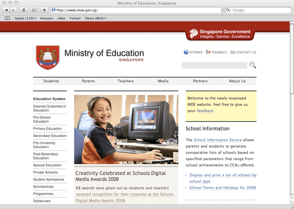
It only occupies a row of space (above) before it slides and expands downwards to reveal more (below).

I liked the idea the moment I saw it. As an information architect, I’m always on a lookout for ideas to navigate lots of information, so this was something quite new to me, and most of all, it works. It works so much better than the typical drop-down menu you often see on bad websites.
It’s certainly not perfect – the space could be better utilized, rather than occupying just the left column. But I see that the web Ribbon has a lot more potential to be further explored and exploited, and I expect to see more websites using the Ribbon interface in the near future.
I asked Lucian, the designer of the site where he got the Ribbon idea from. He told me he just “expanded on the idea” of a normal drop-down menu. He had that idea in 2006, way before he encountered the Ribbon in the Office software.
Whether implemented on a desktop app or on a web page, the Ribbon is definitely a good innovation, a step in the right direction, giving designers and developers an additional tool to improve the user’s experience.
Update:
Lucian has started a blog detailing the development of the Ministry of Education website – Webdev at MOE.
The Ribbon interface
I’ve been using Microsoft Office 2008 for Mac for a few months and so far I’ve been quite happy with it. (Disclosure: I was given a copy by Microsoft.) One of the major changes in the interface is the introduction of the “Ribbon“. The Ribbon interface is a non-threatening and elegant way of organizing and presenting a lot of functions in a relatively small area.
The Ribbon first appeared in Microsoft Office 2007 (for Windows), but they managed to clutter it. The one in Microsoft Office 2008 for Mac is a lot more friendly.
(Update: Nadyne Mielke has informed me that the “Ribbon” in Office 2008 for Mac is called the “Elements Gallery”. I’ll still call it the “Ribbon” as it’s a lot more vivid.)
Before activation, the Ribbon occupies a thin strip, just enough for the labels (see circled).
Once an item is selected (see below), the Ribbon expands downwards, resembling the usual tabbed interface.

The key difference from the usual tabbed interface is that the Ribbon can expand and collapse. It’s a small innovation, but it makes a load of difference.
At first glance, the Ribbon looks quite simple. That’s why it’s elegant – it looks simple and it’s simple to use, but there’s actually a lot of functionality there.
1. Labels and instructions
This lets you know what to expect.

When the mouse is on an item (circled below), the label text changes accordingly.
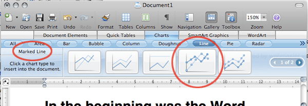
2. Filters to narrow down your search
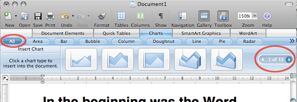
The default “All” gives 15 pages of items in the above case. You can always narrow down your search (below).
Unfortunately, when there are too many filters, it overflows into a menu (below). Not so elegant anymore, but not a big problem those overflow items aren’t accessed often.

3. Additional options
For some items, there is an additional level of options.
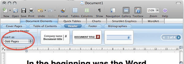
The Ribbon is deceptively simple. To get to the first item in the above diagram, you need at most 3 clicks: Document Elements > Header > Item 1
This is what we’re looking at in a hierarchical view:
- Document Elements
- Cover Pages
- Table of Contents
- Header
- Item 1
- Item 2
- Item 3
- (Next page)
- Footer
- Bibliographies
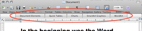
- Quick Tables
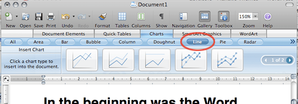
- Charts
- SmartArt Graphics
- WordArt
I mentioned that you need at most 3 clicks to get to Item 1 in the previous image. Well, the good thing about the Ribbon is the next time you need Item 1, 2 or 3, you might need only 2, or even 1 click. Think about it.
Besides reducing the overall number of clicks, the Ribbon interface presents a number of advantages over a drop-down menu interface:
The Ribbon needs less hand-eye coordination. If your mouse strays when using the drop-down menu, you’ll have to start over.
It allows for additional options which comes as a result of the space it occupies when expanded.
The Ribbon allows for bigger icons which comes with more space again.
The Ribbon is more inviting with the bigger icons and more space.
In other words, the Ribbon provides a better user experience for most users.
Microsoft is known for feature-packed (or bloated) software, not user-friendly software. But the Ribbon has shown that they’re still capable of useful innovations every now and then.
For more information, check out Enter the Ribbon by Jenson Harris, explaining some of the thinking behind the Ribbon. Jenson is the Group Program Manager of the Microsoft Office User Experience Team.
(Update: Check out evolution at work by Nadyne Mielke who’s a user experience researcher in the Macintosh Business Unit – the guys behind Office for Mac.)
5 tips on teaching software – delivery
When teaching software, although the approach you take is paramount, how you deliver the lesson can also significantly affect how easily your lesson is followed, and whether the learner can actually use the software by the end of the lesson.
This post assumes a particular setting – the one I’m most used to (both as the teacher and as the learner) – the teacher in front with a computer and projector, and around 15-30 learners with their own computers.
In such a setting, the learner have at least 3 things to look at and focus on – the teacher, the projection screen, and their own screen. They may also be looking at the handouts, or taking notes.
In other words, the learner isn’t always looking at your screen (the projection screen) even if you want them to, or even if you ask them to. They may be trying to copy what you’re doing – click the same buttons, press the same keys, etc. Inevitably, they would miss something on the screen that you’re trying to show.
Which brings me to my first tip…
1. Slow down or pause your mouse
You may be pretty efficient and accurate with the mouse thanks to your great hand-eye coordination. However, the learner would quickly lose track of the tiny mouse pointer if they’re not completely focused on your screen.
Even if they are focused, it’s still hard to follow if the pointer is skipping to different parts of the screen very quickly.
Added to that, because the learner is new to the software, they have no idea where you’re going to move the mouse next. This uncertainty can become stressful, but can be greatly reduced if your mouse pointer slows down, and the learner is easily able to follow the mouse pointer.
An alternative method I prefer (because I find it hard to slow my mouse pointer) is to pause right after I move the mouse.
So instead of moving the mouse to, say, a button and clicking on the button in one swift motion, I would move the mouse to the button and pause or leave it there first, so that the learner has time to relocate my mouse pointer. Then I continue on.
(An exception to this tip is when the learners are already familiar with the step you’re doing. For example, if they’ve already saved the file many times, there’s no need to do the File > save sequence slowly. Just tell them to save the file.)
2. Verbalize positions of controls (buttons, menu items, etc.)
Sometimes, no matter how slowly you move your mouse, the learner just isn’t looking at your screen.
For example, if you’re teaching Powerpoint and you show them the ‘Slide Sorter View’ button and ask them to click it, if they don’t happen to be looking, they wouldn’t know where it is.
It would help a lot more if you say “click on the ‘Slide Sorter View’ button which is right at the bottom left.”
In fact, I would say this instead: “click on the ‘Slide Sorter View’ button which is over here at the bottom left.”
It’s a slight but important difference.
I’ve found from experience that when I say things like “over here”, they know it’s time to look at my screen. It’s just a subtle way of saying “look over here – what I’m showing now is useful!”
And as mentioned in the previous tip, I would also leave my mouse pointer there on the button to give the slower ones more time to locate it.
If it’s within reach, I would even walk to the projection screen and physically point it out. There’s no way they’d lose you like this.
3. Verbalize mouse and keyboard actions
Besides verbalizing where things are, you also want to verbalize what you’re doing.
The learner isn’t just uncertain about where you’re going to move the mouse next, the learner is also uncertain about when you click the mouse button (and which button) or hit a key (or a combination of keys).
One might think that this seems obvious or trivial, but I’ve been through countless software classes where the learners struggle to keep up simply because the teacher didn’t verbalize an important mouse click.
A context menu appearing out of nowhere is particularly mystifying especially for non-expert learners. Even for expert computer user learners, it still takes a bit of thought before they realize that you’ve clicked the right mouse button.
And all this while they’re trying to remember the steps that you’ve just taken, and understand what’s going on.
Thus, make it a habit to verbalize all your mouse clicks and right-clicks and keystrokes.
4. Repeat the more-difficult procedures
The learners won’t always be able to get the steps right the first time, so it’s often a good idea to repeat them.
There’s usually no need to repeat simple one-click steps since those are easy to follow, but which procedures should be repeated depends on the type of learner you’re dealing with.
I’m most used to the non-expert learner, so any procedure that requires 2 steps or more, I repeat.
And if the process is particularly complicated, I would say something like this:
“I’m gonna show you how to do this first. I’ll do it pretty quickly to give you a feel of how it’s done – don’t try to do it yet. After I’ve finished, I’ll go through it again slowly so that you can follow.”
A few things to note from there:
- I assure them that they’ll get an opportunity to follow my steps later
- I show them the steps quickly as an overview
- I show them the steps slowly, both to reinforce, as well as to make it easy to follow
5. Cut down unnecessary mouse movements
A software teacher of mine had this very annoying habit of jerking the mouse around as he spoke. This meant that the mouse pointer would be flying all over the screen as he spoke.
Unnecessary mouse movements is bad enough in any lesson where a computer is used, but it’s far worse in a software lesson.
During the software lesson, the learner subconsciously realizes that it’s important to pay attention to follow where the mouse pointer is moving, so that the correct procedure can followed.
So if the teacher is making unnecessary mouse movements, the learners are also expending unnecessary effort trying to keep track of those movements.
The next time you’re attending a software lesson and you find the teacher moving the mouse unnecessarily, see if you catch yourself trying to keep track of the pointer. You’ll find it even more annoying when you find it hard to stop yourself from tracking the pointer. Then look around the room – you’ll notice most people’s eyes following the mouse pointer as well.
It’s a sad but funny sight.
Conclusion
These tips are simple and small, but they can make quite a lot of difference in your delivery once you manage to turn them into a habit.
Your learners probably won’t notice the changes you’ve made, since most of these are quite subtle. They’d just find that your software lessons have strangely become much easier to follow.
Tips for teaching software – the approach
Most of us who have attended software classes or workshops would know that just because you’re an expert with a software application doesn’t mean you’re good at teaching it.
This applies to most other subjects as well – a history expert or a literature expert doesn’t make them good history or literature teachers. 
Except that the situation may be worse for software experts.
The geek species is not known for empathy, and empathy is important for good teaching. (Empathy is also important in creating user-friendly software, which is why most software aren’t user-friendly – but that’s another story.)
Because most software teachers are geeks to some extent, it is no surprise then, that most software classes and workshops are not well-taught.
This situation isn’t going to change overnight, but I hope the tips in this post would contribute to that change.
The tips in this post deal with the strategy or approach of the lesson. I hope to do another post on some tips on the delivery of software classes.
Without further ado, here are the tips:
Help learners answer “why should I bother with this?”
I wouldn’t dare teach any software application (or anything else for that matter) if I can’t help the learner answer the question, “why should I bother with this?”
This is about making the learning relevant. And if it’s relevant, the learner will be more motivated to learn whatever that’s being taught.
If the learner cannot figure out why they should be learning the application or the feature, then you’re likely to lose them very quickly.
If you’re lucky, the learner already knows why, or eventually figures it out on their own, so it doesn’t hurt so much if you miss out this point. If you’re teaching Powerpoint for example, the learner probably already knows that it can help them with their presentations.
But if you’re teaching Excel as part of a Microsoft Office competence program for retirees, you’ll probably have a lot more trouble.
If your idea of making things relevant is to tell them that Excel is “a spreadsheet and it’s important to know how to use spreadsheets”, good luck – you’ll need lots of it.
But if you tell them that Excel is “a program that can help you keep track of your money, including how much you have in your different accounts, how much you’re getting from your pension and investments, and if you’re getting richer or poorer over the years”, they would have a clearer picture of what they’re getting into, and they’d be a lot more motivated too.
That initial reason you’re giving them doesn’t have to give the complete picture. Like in the above example, we know that Excel can do much more than keeping track of money. But as far as learning is concerned, especially with beginners, it’s much better to start with something incomplete but easily within grasp.
Here’s another example. When I teach Photoshop to beginners, I’ll give a brief introduction:
Photoshop, as it’s name suggests, is a program used to edit photos. This means that after you take a photo, you could improve on it, like make it brighter if it’s too dark, or make it darker if it’s too bright. In fact, as you go along, you’ll find that you can do a lot more in Photoshop – you could change the color of a flower, you could make your complexion clearer. But let’s start with the basics first…
I wouldn’t mention that Photoshop can be used for drawing, for painting, for design, until many lessons later, when they are already familiar with editing photos in Photoshop:
Remember in the first lesson when I said that Photoshop is used to edit photos? I must confess that it’s not the whole truth – Photoshop can be used for design too…
Don’t teach feature by feature – paint scenarios
Teaching feature by feature is probably the most common and glaring mistake in teaching software, especially when the learners are beginners. If the class is boring, it’s probably because of this mistake.
This is when the teacher teaches the application by going down the list of features, teaching one feature after another. Some may go down each menu item, or each toolbar button.
This approach is convenient if you want to cover every feature in the application.
But the problem with this approach is that it doesn’t match the mental model of the learner. When the learner uses the application in future, it’s because they have a problem to solve. They have to go through a thinking process that maps the solution with the features that will help them solve the problem.
If they were taught feature by feature, it would take considerable effort and intelligence to pick out the features relevant to solving that problem. It doesn’t occur to them easily that those features (that they’re supposed to have been taught) can actually be used to solve that problem.
So when you do point out to them how those features could be used in concert to solve the problem, they might exclaim, “why didn’t I think of that?”
Perhaps they didn’t think of that because it’s the teacher’s fault.
It would be a lot more useful, interesting, and relevant if you painted scenarios or problems before introducing the application or feature.
So, when teaching Microsoft Word, the typical geek approach when introducing the page break feature is to just introduce it:
To insert a page break, go to Insert > Break > Page Break. See the page break? Good. Try it out, then we’ll go on to the next feature.
Snore. Most learners would just go through the motions, and they would miss the significance of the feature.
It would be far better to introduce a scenario first:
While Word automatically adds new pages for you, as you might have noticed already, there may times when you want to continue on new page, even before you reach the end of the current page.
For example, you may have reached the end of a major section in your report, and you want to start the next section on a fresh page.
To do that, you have to insert a page break. Go to Insert > Break > Page Break.
It takes a little longer, but it will definitely stick a lot better. Even if the learner doesn’t remember exactly how to activate that feature, they’re likely to at least remember that such a feature exist.
Even better, if you have the time, you could make things more interactive and to stimulate more thinking, by asking the learners to come up with their own scenario:
To insert a page break, go to Insert > Break > Page Break. Try this out, then give me an example of a situation when you’d use this feature.
But what if you want to teach a feature, but you can’t think of a scenario that relates to the learners?
Don’t teach every single feature – only the useful ones
It’s tempting to cover as many features as possible, and there’s often some pressure to do so.
I’ve taught some classes where the learners pay for the workshops out of their own pockets, so they want to get the most out of what they’re paying for.
In such cases, I’d tell them at the outset that I won’t be teaching every single feature. After a brief pause to let them regain their composure, I tell them “if you want to know about every feature, you can read the help file. And, there’s not enough time to cover everything anyway”.
Instead, I promise them that what they’ll learn would be useful to them. “We’ll start with the basics, and I’ll make sure you understand the important concepts really well, so that you’ll have a good foundation to build on. Then we’ll move on to the more advanced stuff if we have the time. If not, the foundation you have will help you understand the help file.”
So which features to cover? You should focus on the features that will be most useful to the learner. So if the learners are beginners, start with the basic ones. And if you follow the previous tip and use scenarios, you’ll already have some idea as to which features to cover and which to drop. If the learners are newbies, start with the most basic and common scenarios – these would cover the most useful features.
If you have more time, then go on to other scenarios, from the most common to less common scenarios.
If time doesn’t permit me to cover some other less-common-but-possibly-useful features in detail, I normally spend a short time just “flagging” some of these features.
For example, if I’m teaching Photoshop, I might have taught them the sharpen and blur “filters” (features used to sharpen or blur photos). Photoshop has many other “filters”, but I wouldn’t cover them. Instead, I’d tell the learners,
You’re already familiar with the sharpen and blur filters. If you look at the Filter menu in Photoshop, you’ll see a whole bunch of other filters – each of them will give a different effect to the photo. I won’t cover them, but do go and try each of them out in your own time and play with them to see their effects.
Then I move on to the next scenario.
Conclusion
If you’re already an expert with a software application, teaching it well isn’t a difficult thing once your approach is right.
Take a bit of time to look at your approach, and keep putting yourself in the shoes of the learners (yes try to empathize with them), and you’ll be well on your way to becoming a pretty good software teacher!
The Princess, the Witch, and the PowerPoint
Once upon a time, there was a beautiful princess…
The lecture room was pretty rowdy before I began, but the 17-year olds were soon absorbed my this fairy tale that I concocted to teach them the things to avoid and a few design principles when creating a PowerPoint presentation.
This story started some years ago, when I was still teaching at Ngee Ann Polytechnic. A few lecturer colleagues who had attended some of my PowerPoint workshops thought that the material would be helpful for their own students, so I agreed to guest lecture for them.
My initial presentation was called “PowerPoint Evils, And How to Avoid Them”.
(The animations and sounds are missing in the above.)
While students generally enjoyed that presentation, I eventually figured that I could do much better, especially since I had done a lot more thinking and learning in the area.
Thus came the idea to revamp that presentation completely, and convey the message using a silly fairytale – “The Princess, the Witch, and the PowerPoint”.
The video was taken when I was invited back to Ngee Ann Polytechnic again some time back to give the lecture to a group of Mass Communication students. Thanks to Kevin Lim for taking the video!

4 comments