Web Ribbon
In my last post, I talked about the Ribbon interface in Microsoft Office – a good solution with limited screen estate, without the usability problems of the cascading menu.
Now what if the Ribbon was used on a webpage?
My only encounter with it so far is on Singapore’s Ministry of Education homepage, which was launched only a couple of weeks back.
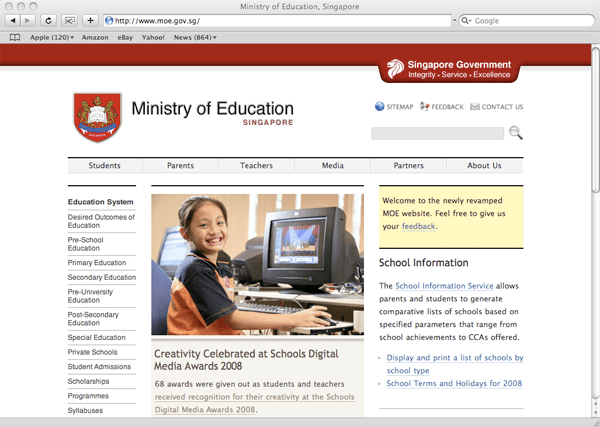
It only occupies a row of space (above) before it slides and expands downwards to reveal more (below).

I liked the idea the moment I saw it. As an information architect, I’m always on a lookout for ideas to navigate lots of information, so this was something quite new to me, and most of all, it works. It works so much better than the typical drop-down menu you often see on bad websites.
It’s certainly not perfect – the space could be better utilized, rather than occupying just the left column. But I see that the web Ribbon has a lot more potential to be further explored and exploited, and I expect to see more websites using the Ribbon interface in the near future.
I asked Lucian, the designer of the site where he got the Ribbon idea from. He told me he just “expanded on the idea” of a normal drop-down menu. He had that idea in 2006, way before he encountered the Ribbon in the Office software.
Whether implemented on a desktop app or on a web page, the Ribbon is definitely a good innovation, a step in the right direction, giving designers and developers an additional tool to improve the user’s experience.
Update:
Lucian has started a blog detailing the development of the Ministry of Education website – Webdev at MOE.
The Ribbon interface
I’ve been using Microsoft Office 2008 for Mac for a few months and so far I’ve been quite happy with it. (Disclosure: I was given a copy by Microsoft.) One of the major changes in the interface is the introduction of the “Ribbon“. The Ribbon interface is a non-threatening and elegant way of organizing and presenting a lot of functions in a relatively small area.
The Ribbon first appeared in Microsoft Office 2007 (for Windows), but they managed to clutter it. The one in Microsoft Office 2008 for Mac is a lot more friendly.
(Update: Nadyne Mielke has informed me that the “Ribbon” in Office 2008 for Mac is called the “Elements Gallery”. I’ll still call it the “Ribbon” as it’s a lot more vivid.)
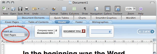
Before activation, the Ribbon occupies a thin strip, just enough for the labels (see circled).
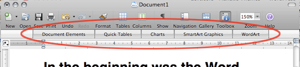
Once an item is selected (see below), the Ribbon expands downwards, resembling the usual tabbed interface.

The key difference from the usual tabbed interface is that the Ribbon can expand and collapse. It’s a small innovation, but it makes a load of difference.
At first glance, the Ribbon looks quite simple. That’s why it’s elegant – it looks simple and it’s simple to use, but there’s actually a lot of functionality there.
1. Labels and instructions
This lets you know what to expect.

When the mouse is on an item (circled below), the label text changes accordingly.
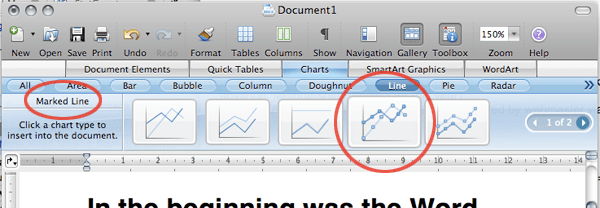
2. Filters to narrow down your search
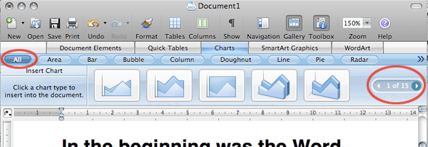
The default “All” gives 15 pages of items in the above case. You can always narrow down your search (below).
Unfortunately, when there are too many filters, it overflows into a menu (below). Not so elegant anymore, but not a big problem those overflow items aren’t accessed often.

3. Additional options
For some items, there is an additional level of options.
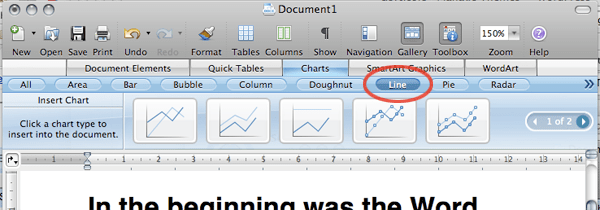
The Ribbon is deceptively simple. To get to the first item in the above diagram, you need at most 3 clicks: Document Elements > Header > Item 1
This is what we’re looking at in a hierarchical view:
- Document Elements
- Cover Pages
- Table of Contents
- Header
- Item 1
- Item 2
- Item 3
- (Next page)
- Footer
- Bibliographies
- Quick Tables
- Charts
- SmartArt Graphics
- WordArt
I mentioned that you need at most 3 clicks to get to Item 1 in the previous image. Well, the good thing about the Ribbon is the next time you need Item 1, 2 or 3, you might need only 2, or even 1 click. Think about it.
Besides reducing the overall number of clicks, the Ribbon interface presents a number of advantages over a drop-down menu interface:
The Ribbon needs less hand-eye coordination. If your mouse strays when using the drop-down menu, you’ll have to start over.
It allows for additional options which comes as a result of the space it occupies when expanded.
The Ribbon allows for bigger icons which comes with more space again.
The Ribbon is more inviting with the bigger icons and more space.
In other words, the Ribbon provides a better user experience for most users.
Microsoft is known for feature-packed (or bloated) software, not user-friendly software. But the Ribbon has shown that they’re still capable of useful innovations every now and then.
For more information, check out Enter the Ribbon by Jenson Harris, explaining some of the thinking behind the Ribbon. Jenson is the Group Program Manager of the Microsoft Office User Experience Team.
(Update: Check out evolution at work by Nadyne Mielke who’s a user experience researcher in the Macintosh Business Unit – the guys behind Office for Mac.)
Forms Created by Nazi Developers
I was doing a bit of research on a site, and had to fill in a form. It was an application form for a university course.
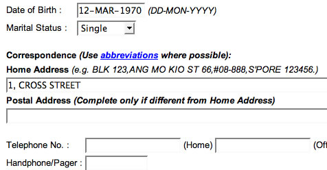
As you can see above, I had filled in an address in the “Home Address” field.
Then I got this Javascript error message:

“Must end with a full-stop, have at least 1 but not more than 3 commas”? Amazing. Perhaps this is just a way to filter out applicants who have a poor comprehension of English.
Undaunted, I obediently added the missing “full-stop” to my fictitious address (even though I could have turned off Javascript instead), so it became
1, CROSS STREET.
(Note the “full-stop” I dutifully added. Also, it’s in CAPITAL LETTERS because the Javascript converted it so.)
Perfect.
Until I tried to submit the form, where I was greeted with another Javascript error:

I couldn’t stop laughing.
The real applicant probably wouldn’t be laughing though.

1 comment