Web Ribbon
In my last post, I talked about the Ribbon interface in Microsoft Office – a good solution with limited screen estate, without the usability problems of the cascading menu.
Now what if the Ribbon was used on a webpage?
My only encounter with it so far is on Singapore’s Ministry of Education homepage, which was launched only a couple of weeks back.
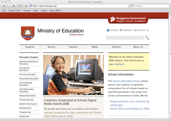
It only occupies a row of space (above) before it slides and expands downwards to reveal more (below).

I liked the idea the moment I saw it. As an information architect, I’m always on a lookout for ideas to navigate lots of information, so this was something quite new to me, and most of all, it works. It works so much better than the typical drop-down menu you often see on bad websites.
It’s certainly not perfect – the space could be better utilized, rather than occupying just the left column. But I see that the web Ribbon has a lot more potential to be further explored and exploited, and I expect to see more websites using the Ribbon interface in the near future.
I asked Lucian, the designer of the site where he got the Ribbon idea from. He told me he just “expanded on the idea” of a normal drop-down menu. He had that idea in 2006, way before he encountered the Ribbon in the Office software.
Whether implemented on a desktop app or on a web page, the Ribbon is definitely a good innovation, a step in the right direction, giving designers and developers an additional tool to improve the user’s experience.
Update:
Lucian has started a blog detailing the development of the Ministry of Education website – Webdev at MOE.

Another eg:
http://www.usp.nus.edu.sg/
Agagooga: That’s not exactly a good example of it, since the menu doesn’t persist if your mouse moves away from it.
Oops.