7 Accessibility Sins I’m Tired of Pointing Out to UI/UX Designers
Dear UI/UX designer,
I’m tired of seeing these mistakes over and over again coming out from UI/UX designers I’ve worked with.
Some are exceptionally talented, producing beautiful web or app designs consistently, but almost all of them commit at least a few of these sins.
If you ever work with me, I will make sure you have this list burned indelibly into your mind before we start.
Technical note:
Most of my list items are based on the WCAG AA accessibility standards, which is the standard that most organisations (claim they) conform to. If you don’t know what things like WCAG, AA, and Accessibility refer to, go find out. These are basic stuff you should know.
Here are the 7 accessibility sins:
1. Text contrast too low
Yes, lower contrast text make the design more aesthetically pleasing, sophisticated, or even improve visual hierarchy. But what’s the point of pretty text when I have to strain my eyes to read it?
Go use a contrast checker. You’re gonna hate it, but a lot more people are going to hate you if you don’t.
This is the kind of contrast you love:

These are the exact colours used by a well-known organisation on their website. It was designed by a top international design firm. Shameful.
The contrast ratio for the above example is 2.99:1, which is less than the 4.5:1 minimum needed to pass the AA standard.
At 4.54:1, this next example just passes the AA standard (4.5:1), and it’s way more comfortable to read, even for someone with normal eyesight:

(For larger headline text, the contrast can be slightly lower at 3:1.)
2. Text size too small
If your text size is below 10 points, it’s too small. Like this:

You should be able to read that if you’re a real designer. You should also be able to tell if a design is off by one pixel. But if you’re designing something for the rest of humanity that does not have razor sharp eyesight like yours, stop using minuscule text.
3. USING ALL CAPS
Using all caps is seductive, because it makes the texture of the text look so much more even and appealing.
Until you actually try to read the stuff – all caps is a pain to read quickly, simply because people are not used to it:

The exception is when you only have a couple of words, like in a short heading. Then it’s not so sinful.
According to WCAG, we should use upper and lower case according to the spelling rules of the text language.
4. Using centre-aligned text
Centre-aligned text is so balanced, it’s so hard not to use it, especially if your design has other centred elements.
But as usual, centre-aligned text is harder to read especially when it spans multiple lines. This is because the reader has to spend effort locating the start of each line when reading.

The WCAG simply says this without much explanation:
Avoiding centrally aligned text
I’m way more reasonable – 1 or 2 lines of centre-aligned text is still OK; 3 is really pushing it. Beyond that, don’t. Use left-aligned text instead, unless you’re designing for Arabic or Hebrew or some other right-to-left language.
5. Using justified text
Some of you might then ask, “how about justified text”?
I question your aesthetic sense if you use it on a digital interface – good designers know to avoid this because its texture is uneven. In other words, it’s ugly.

Besides its lack of aesthetic value, it also affects accessibility.
WCAG has this to say about justified text:
People with certain cognitive disabilities have problems reading text that is both left and right justified. The uneven spacing between words in fully justified text can cause “rivers of white” space to run down the page making reading difficult and in some cases impossible. Text justification can also cause words to be spaced closely together, so that it is difficult for them to locate word boundaries.
I hate to repeat myself, but just use left-aligned text already.
6. Text line width too wide
The good news is this mistake is becoming less problem – more designers realise that long line lengths is harder to read, especially when the text spans multiple lines.
The lines in this paragraph of text is too long (line width around 100 characters):

This one (line width up to 80 characters) is just within the WCAG AAA guideline:

Just remember to keep your line widths within 80 characters or less.
(“HAH!” the sharper ones of you might point out, “the line length of this very post is way more than 80 characters! You hypocrite!”
You got me there. In my feeble defence, I didn’t design or code this template. Let’s forget this issue and move right along to the 7th sin…)
7. Using colour alone to convey information
Last but definitely not least, don’t use colour alone to convey information, for the sake of colourblind users. Yes, use colour, but add some other redundant way to convey information.
See this form:

Looks fine to you since you’re not colourblind (I haven’t met any colourblind UI/UX designers yet). But if we remove the colour information…

Not very useful now, is it?
Here’s an alternate way to do the same form that works better:

Same form with colour removed:

That wasn’t so hard, was it?
This issue is also common with diagrams and charts. See this chart with and without colour:

Even your normal users will have a problem if they print your chart in black/white.
The same chart that doesn’t just rely on colour:

Just a little extra thought and effort and your problem is solved.
Moving on…
It’s time you realise that UI/UX design isn’t just about aesthetics, but about many other issues like accessibility. These 7 accessibility sins are by no means exhaustive; they’re just the most common I’ve encountered from designers who don’t know better.
If you’re a UI/UX designer, you now know better.
5 Steps to Create Good User Interview Questions
If you want to know how to come up with user interview questions for UX (user experience) research, check out this link:
5 Steps to Create Good User Interview Questions By @Metacole — A Comprehensive Guide
The article was written by Yu Sheng, a talented UX designer working at ReferralCandy; you might have noticed that he mentioned me as I was his UX coach.
It was a real privilege and pleasure to coach someone like him who was eager to learn and really understand UX.
Our focus was on user research interviews. I wanted to improve his thinking about the interview process, so that he wouldn’t just know how to handle one type of interview situation, but all kinds. It’s not just learning how to fish, but knowing how to fish with any available tool at hand and in any environment.
Here’s also what he wrote of the experience, which was rather flattering:
Coleman knows his stuff. Our coaching session focused on interviewing techniques, and he was able to explain and provide great tips for the processes of creating the questions, conducing the interview, and analysing the results. His coaching method challenges you to think, and to think better.
Massive thanks to Ruth from Byu-RHO Consulting for dragging me into this; and Zach, co-founder of ReferralCandy, for giving Ruth and me the opportunity to coach his guys.
Web Ribbon
In my last post, I talked about the Ribbon interface in Microsoft Office – a good solution with limited screen estate, without the usability problems of the cascading menu.
Now what if the Ribbon was used on a webpage?
My only encounter with it so far is on Singapore’s Ministry of Education homepage, which was launched only a couple of weeks back.
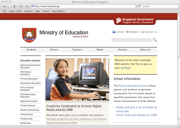
It only occupies a row of space (above) before it slides and expands downwards to reveal more (below).

I liked the idea the moment I saw it. As an information architect, I’m always on a lookout for ideas to navigate lots of information, so this was something quite new to me, and most of all, it works. It works so much better than the typical drop-down menu you often see on bad websites.
It’s certainly not perfect – the space could be better utilized, rather than occupying just the left column. But I see that the web Ribbon has a lot more potential to be further explored and exploited, and I expect to see more websites using the Ribbon interface in the near future.
I asked Lucian, the designer of the site where he got the Ribbon idea from. He told me he just “expanded on the idea” of a normal drop-down menu. He had that idea in 2006, way before he encountered the Ribbon in the Office software.
Whether implemented on a desktop app or on a web page, the Ribbon is definitely a good innovation, a step in the right direction, giving designers and developers an additional tool to improve the user’s experience.
Update:
Lucian has started a blog detailing the development of the Ministry of Education website – Webdev at MOE.
The Ribbon interface
I’ve been using Microsoft Office 2008 for Mac for a few months and so far I’ve been quite happy with it. (Disclosure: I was given a copy by Microsoft.) One of the major changes in the interface is the introduction of the “Ribbon“. The Ribbon interface is a non-threatening and elegant way of organizing and presenting a lot of functions in a relatively small area.
The Ribbon first appeared in Microsoft Office 2007 (for Windows), but they managed to clutter it. The one in Microsoft Office 2008 for Mac is a lot more friendly.
(Update: Nadyne Mielke has informed me that the “Ribbon” in Office 2008 for Mac is called the “Elements Gallery”. I’ll still call it the “Ribbon” as it’s a lot more vivid.)
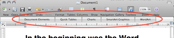
Before activation, the Ribbon occupies a thin strip, just enough for the labels (see circled).
Once an item is selected (see below), the Ribbon expands downwards, resembling the usual tabbed interface.

The key difference from the usual tabbed interface is that the Ribbon can expand and collapse. It’s a small innovation, but it makes a load of difference.
At first glance, the Ribbon looks quite simple. That’s why it’s elegant – it looks simple and it’s simple to use, but there’s actually a lot of functionality there.
1. Labels and instructions
This lets you know what to expect.

When the mouse is on an item (circled below), the label text changes accordingly.
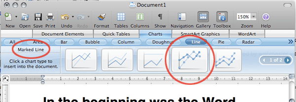
2. Filters to narrow down your search
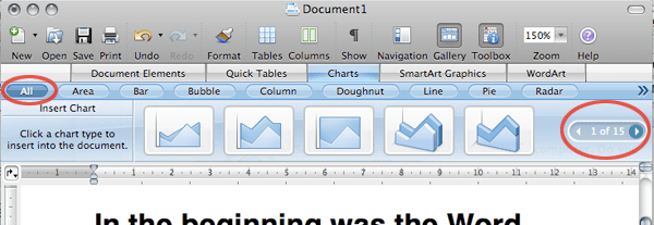
The default “All” gives 15 pages of items in the above case. You can always narrow down your search (below).
Unfortunately, when there are too many filters, it overflows into a menu (below). Not so elegant anymore, but not a big problem those overflow items aren’t accessed often.

3. Additional options
For some items, there is an additional level of options.
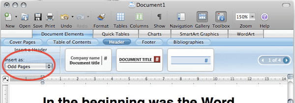
The Ribbon is deceptively simple. To get to the first item in the above diagram, you need at most 3 clicks: Document Elements > Header > Item 1
This is what we’re looking at in a hierarchical view:
- Document Elements
- Cover Pages
- Table of Contents
- Header
- Item 1
- Item 2
- Item 3
- (Next page)
- Footer
- Bibliographies
- Quick Tables
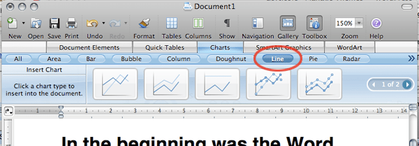
- Charts
- SmartArt Graphics
- WordArt
I mentioned that you need at most 3 clicks to get to Item 1 in the previous image. Well, the good thing about the Ribbon is the next time you need Item 1, 2 or 3, you might need only 2, or even 1 click. Think about it.
Besides reducing the overall number of clicks, the Ribbon interface presents a number of advantages over a drop-down menu interface:
The Ribbon needs less hand-eye coordination. If your mouse strays when using the drop-down menu, you’ll have to start over.
It allows for additional options which comes as a result of the space it occupies when expanded.
The Ribbon allows for bigger icons which comes with more space again.
The Ribbon is more inviting with the bigger icons and more space.
In other words, the Ribbon provides a better user experience for most users.
Microsoft is known for feature-packed (or bloated) software, not user-friendly software. But the Ribbon has shown that they’re still capable of useful innovations every now and then.
For more information, check out Enter the Ribbon by Jenson Harris, explaining some of the thinking behind the Ribbon. Jenson is the Group Program Manager of the Microsoft Office User Experience Team.
(Update: Check out evolution at work by Nadyne Mielke who’s a user experience researcher in the Macintosh Business Unit – the guys behind Office for Mac.)
The Future of Internet Is Virtual Worlds. Or Is It?
“The future of internet is virtual worlds. Or is it?”
That was the topic of discussion in one of the sessions at the recent Web 2.0 Unconference.
The discussion leader Douglas Abrams defined a virtual world as a fully-immersive 3D environment that is shared by everyone and used for interactions in areas like entertainment, communication, and commerce.
Basically, the internet will become primarily 3D, instead of 2D as it is today.
He believed that the internet will eventually become a 3D virtual world (or worlds), simply because of the richness of information that 3D is able to communicate, as compared to textual, visual, or video information.
He’s wrong.
His is a common mistake – the same mistake that people years ago made when they predicted that TV would kill radio.
But I’m running ahead of myself.
The internet as we know it now is mostly what I would call “informational” – where people access content. This could be for knowledge (reading up a wikipedia article or my blog *ahem*) or for entertainment (reading my blog *AHEM*).
Currently, while the content is mostly in the form of text (like wikipedia and my blog again), there are other forms of content, including audio (podcasts, webradio), still visuals (photos, illustrations), and moving visuals (video, Flash animations).
Besides the informational, the internet also has a large experiential element. These are interactive elements or environments, where the interactive experience is the goal itself, and not a means to an end. These would include Flash games, simulations, and so on.
What do we get when web designers fail to distinguish the informational from the experiential? Flash-based websites that are a pain to navigate. Sure, surfing Flash-based informational websites is certainly a “richer” experience, thanks to pretty animations and sound effects, but when the information I want is best represented by text, don’t give me any animations along with it. Let alone a 3D experience.
Here’s another example – RSS feeds. I can go to a news site or a blog to read the informational content, and experience the look and feel of that site as well. But why do many people eventually move to reading the same content from RSS aggregators? Yes, the convenience, but many of us are eventually only interested in the informational content, not the experiential.
Virtual 3D worlds are better suited for the experiential, much like Flash. Because they are experiential in nature, they are great for the user to experience something, like exploring a new environment, playing an immersive game, or having social interactions with others. Thus 3D worlds are certainly here to stay, since they are best for certain types of the expriential.
Now if a user wants the informational rather than the experiential, and a 3D environment is given, it may not be pretty, especially when the novelty of 3D wears off. Remember those horrific Flash sites you tried to navigate through? The horrificity of 3D will be worse in an order of magnitude, thanks to the additional third dimension.
So are virtual worlds the future of the internet?
No, it won’t. Unless…
Only unless the experiential overtakes the informational on the internet in the future.
Will that ever happen? I hope to explore this in a later post.
Update:
Read part 2 here, or jump to part 3, “Why the Matrix Will Not Happen“.
Addendum:
Kevin posted a video of the discussion. The quality of the discussion wasn’t great, so it may not be worth watching.
Information Architecture, In Short
In my new role as a Design Consultant, I’m involved in the design of user experiences (UX) – what a user experiences when they are, say, visiting a website.
When people ask me what I do, one of the things I usually mention is Information Architecture (IA), which is a part of user experience (UX) design.
Blank look. During that brief moment, I can tell that most people are thinking if they should ask me to explain further or not.
Then I’d go ahead with an explanation similar to this:
When you have a large website, it’s common for the information to be badly organized, such that it’s hard to find the information you’re looking for, right?
I’d pause and wait for some glimmer of understanding to appear in their eyes, before continuing:
What the Information Architect does is to use various methods, such as user studies, surveys, et cetera, to find out what is the optimum way to organize the information on the website, so that the website becomes a lot more user-friendly.
That’s when they usually get it.
It’s been a week into this new job, and I’ve been learning a tremendous amount, and there’s still loads to learn.
Things are getting interesting.
 μεταcole
leave a comment